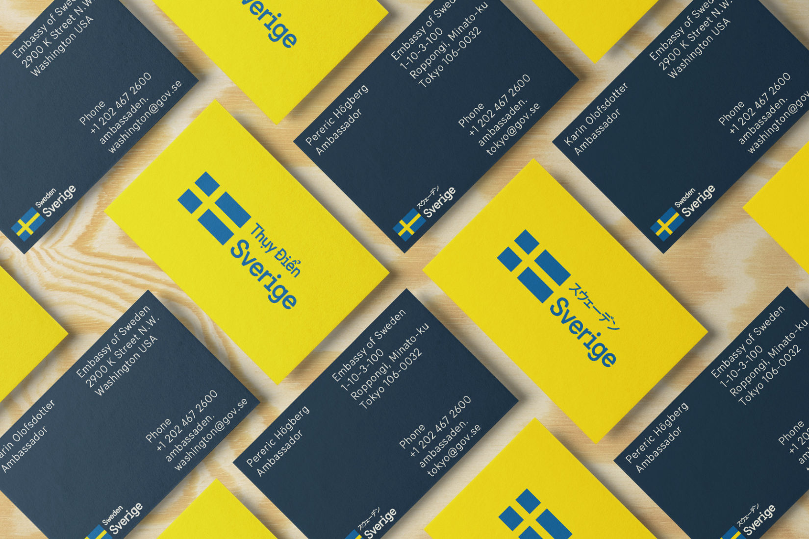
Sweden’s visual identity is widely used in communication with an international target group. It is the basis for Sweden’s digital presence and in other contexts where Sweden is shown abroad, for example at world exhibitions, state visits and by Swedish embassies and consulates.
Sweden’s visual identity was launched for the first time in 2013 and aroused great interest – both in Sweden and internationally. Above all, attention was paid to the specially designed font Sweden Sans. A comprehensive update is now being launched that includes a new color scale, license-free fonts, guidelines for moving media, and available design.
– We want the identity to last long-term at the same time as it feels current and can be adapted to different channels and trends, says Christian Biller, brand strategist and project manager at SI.
Behind the design update is the agency Söderhavet, which was also behind the first version.
– When we developed the Sweden identity in 2012-2013, we cared about a dynamic solution that could change over time, without losing the core of the brand. With the new design, there is greater flexibility and more opportunities for those who work with the Sweden brand, which feels both fun and important, says Jesper Robinell, Creative Director at Söderhavet.
Sweden’s visual identity can be found at identity.sweden.se.
